Products
Product availability, functionality and terms may differ for customers with billing addresses in the European Economic Area (EEA). Learn more
Solutions
By industry
By use case
Products
Product availability, functionality and terms may differ for customers with billing addresses in the European Economic Area (EEA). Learn more
Solutions
By industry
By use case
Products
Product availability, functionality and terms may differ for customers with billing addresses in the European Economic Area (EEA). Learn more
Solutions
By industry
By use case


Find the right product for the job
Discover Google APIs and SDKs to create geospatial experiences, and datasets and tools to access insights for your business.
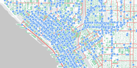
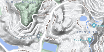
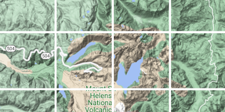
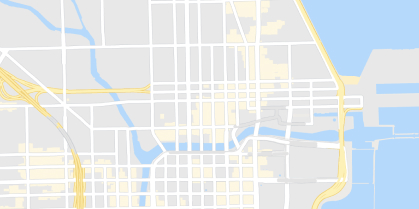
Maps
Help users explore the world with detailed, custom maps products.
Routes
Help your users optimize the way from A to Z.
Places
Show users places and points of interest with details at their fingertips.

Environment
Help users access data to respond to the climate challenges of today.
Analytics
Discover geospatial datasets and tools that enable you to reveal powerful business and sustainability insights.
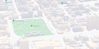
Maps
Build customized, agile experiences that bring the real world to your users with Photorealistic 3D Maps, cloud-based maps styling and 360° Street View imagery.

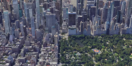
3D Maps
Create Photorealistic 3D Maps in Maps JavaScript using Google’s rendering technology.
Learn more

Aerial View
Delight your users with pre-rendered, 3D cinematic video of points of interest and their surroundings.
Learn more
Dynamic Maps
Customize and style interactive maps using Cloud-based maps styling for real time updates across all devices and platforms.
Learn more

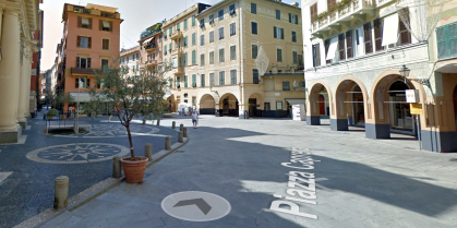
Dynamic Street View
Embed real-world imagery with 360° panoramas.
Elevation
Provide a simple interface to query locations on the earth for elevation data.
Maps Embed
Add an interactive map or Street View panorama to your site, using a simple HTTP request.
Map Tiles
Design interfaces and interactions unique to your brand and design requirements, and customize your visualizations.
Learn more
Photorealistic 3D Tiles
Access a 3D mesh model of the real world and use the renderer of your choice to create cinematic experiences.
Learn more
Static Maps
Embed simple map images on your website with minimal code.
Static Street View
Embed a static (non-interactive) Street View panorama or thumbnail into your web page, without the use of JavaScript.
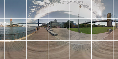
Street View Tiles
Use images taken from street level and tile metadata to create powerful, immersive experiences.
Learn more
Routes
Help your users find the ideal way to get from A to Z with comprehensive data and real-time traffic.
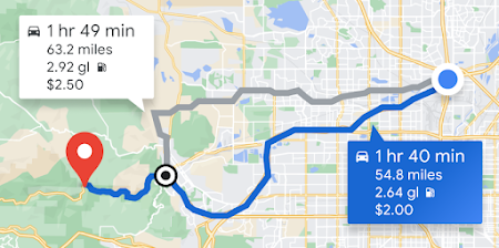
Compute Routes
Provide directions with real-time traffic for transit, biking, driving, 2-wheel motorized vehicles, or walking between multiple locations.
Learn more
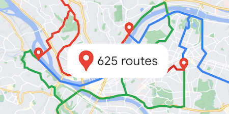
Compute Routes Matrix
Calculate travel times and distances for multiple destinations for up to 625 route elements.
Learn more

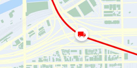
Roads
Determine the route a vehicle travels.

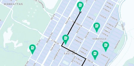
Route Optimization
Optimize multi-stop routes for one or more vehicles flexibly and intelligently.
Places
Help users discover the world with rich place data for over 200 million points of interest. Enable them to find specific places using phone numbers, addresses, and more.
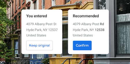
Address Validation
Validate an address and its components, standardize the address for mailing, and determine the best known geocode for it.
Learn more
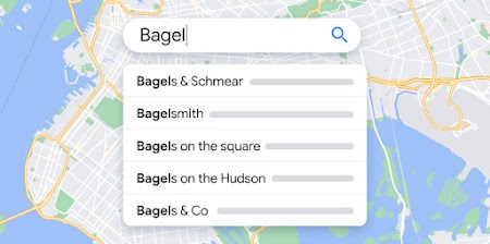
Autocomplete
Help users quickly find the exact place they’re looking for by automatically suggesting businesses and points of interest as they type.
Learn more
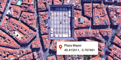
Geocoding
Convert addresses to geographic coordinates or the reverse.

Geolocation
Return the location of a device without relying on GPS, using geospatial data from cell towers and WiFi nodes.
Nearby Search
Search for places within a specified area with the option to refine by place type.
Learn more

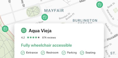
Places Aggregate
Get specific insights to improve user experience for users discovering or researching an area.


Places UI Kit
Bring the familiar Google Maps UI for Places to your front-end applications with just a few lines of code.
Learn more
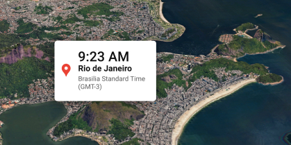
Time Zone
Get the time zone for a specific latitude and longitude coordinate.
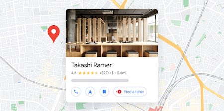
Text Search
Provide information about a set of places based on a single search query and any specified location.
Learn more
Environment
Get the latest data on the environment in a given location. Then use this data for everything from keeping allergy sufferers healthy to designing optimized solar panel array designs.

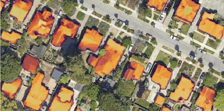
Solar
Use advanced data and imagery to create more advanced solar array designs and proposals, while eliminating costly site visits.
Learn more
Pollen
Improve daily life for allergy sufferers with up-to-date information on different types and levels of pollen.
Learn more

Analytics
Discover geospatial datasets and tools that enable you to reveal powerful business and sustainability insights.
Datasets

Imagery Insights
Streamline operations and improve workflows with AI-powered insights, using Google Maps Platform imagery integrated with BigQuery and Vertex AI.
Learn more

Places Insights
Combine your data with Google Maps’ rich POI data using Places Insights in BigQuery’s data clean rooms.
Learn more

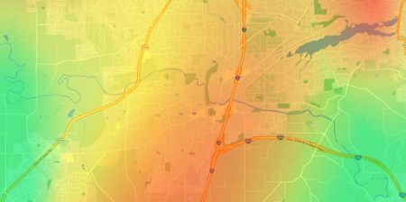
Roads Management Insights
Overcome the limitations of traditional traffic data collection methods and proactively respond to congestion and traffic issues.
Learn more
Tools

Earth Engine (Google Cloud)
Explore a multi-petabyte catalog of satellite imagery and geospatial datasets with planetary-scale analysis capabilities.
Learn more

Google Earth
Analyze, build, and collaborate to make decisions with a comprehensive, interactive model of our world.
Learn more


-
*Free usage refers to monthly calls available at no cost. Essentials Map Tiles APIs provide up to 100,000 calls at no cost per SKU per month.
-
Product availability, functionality and terms may differ for customers with billing addresses in the European Economic Area (EEA). Learn more